:::||> CONVERT SHOPPER INSIGHTS INTO CASHFLOW <|| :::

retail marketing strategy, consulting assignments, executive workshops, conferences and research services, merchandising ideas, advertising ideas, consumer behavior, shopper behavior, shopper marketing, shopper insight, retail e-commerce


Sep 30, 2009

Hot and Sweet


Sugar Fix, Westfield Pitt St.  Exceptionally attractive store with welcoming frontage and good promotional offers upfront. Great use of under-lighting at the front of the store.   It looks, feels, smells, even tastes like a sweet shop :)

Peace brothers


Spotted in a jeweller's window, George St.  Targetting the Baby Boomers.

Meet Your Match


Target, Broadway.  A brilliant display for nail polish - I almost reached for one myself :)


Target misses the target

Target, Broadway. I generally enjoy shopping at Target. However, on a Sunday afternoon, at a fairly busy shopping period, I came across three examples in a short space of time of out-of-stocks. These are the kiss-of-death for a retailer - something they teach in Retailing.101.

They obviously make it hard to make a sale - you can't sell space. They dilute the impact of the display of the in-stock items - the eye needs symmetry and people seek out 'abundance'. And finally, they annoy shoppers looking for promoted items. Managers need to focus on 'recovery' and replenishment. It's simple.

Hair today, hair tomorrow


Coles, Surry Hills.  It IS commendable that Coles are starting to act more like a retailer than like the corporate fatcats they had been for a long time.  I was interested to see their take on the old retailer's BOGOF - Buy One Get One Free.  This was spotted in the health and beauty aisle, scene of much  experimentation, and the deal was 'buy two get the third free'.  Now for me that would mean about three years' supply of shampoo :)  I would speculate they might have some takers, but who would mainly switch from other brands. Having said that the Coles' margins are probably higher on this product given their supplier contribution on a promoted range.

Sep 29, 2009

Free food ?


Live, MLC Centre.  Beautiful food, pity the price is covered up on the ticket :(  BTW the answer is $6 - I eventually asked :)


Very Tempting


Lush, Metropolitan centre.  Very clever marketing from Lush - placement of these yellow gifts right at the door -- beautifully wrapped and presented just makes you want to pick one up.  Also, the choice of yellow is great - positive, happy colour, stands out in the relatively gloomy mall walkway.


Cautionary Tale


Sportsgirl, Metropolitan centre.  I am unsure about this window treatment from the usually effective Sportsgirl team.  The cues are 'danger, caution' which while probably not a major for their target market (compare to Harvey Norman posts below) are enough of a distraction from the otherwise interesting window, to dilute it's impact.


Campaign Delivery


Target, Broadway.  Delivering on the campaign promise: 'Every Colour You can Dream Of'.


Sep 28, 2009

On-Target signage


Target, Broadway.  Spot-on department signage graphic for childrens footwear.


Faux Faberge more than cosmetic


Cosmetic shop, Broadway.  Stunning window to promote a Russian-themed brand.


Nando's escalates advertising


Broadway mall.  Innovative use of escalator handrail for advertising by Nando's, who have been using non-traditional advertising methods since involving a new agency.


The 'New' Health and Beauty


Coles, Surry Hills.  Ok, I am always going on about 'new-ness' and 'fresh-ness' sells.  However, Coles seems to have found a new product category in the health and beauty section.  Called 'New' it is clearly a hair product, fitting in as it does between 'Hair Styling' and 'Hair Colour'.  It will be interesting to see how they go - personally I don't believe shoppers will seek out 'new' h&b products the way they would in say food items.  An interesting experiment.

Bakers Delight no Fitness First


Bakers Delight, Surry Hills.  I couldn't help thinking they were 'pushing water uphill' with this Fitness bars promotion.


What Shoppers Do


Outside  Harvey Norman, Broadway.  Sometimes it is mildly amusing what shoppers try to do. This shopper had just purchased a rather large printer from Harvey Norman.  She then proceeded to unpack the entire box in the mall, and try to get the printer and contents to fit into her shopping bag trolley - the sort you see people using for small purchases of groceries.  Despite it being obvious that 2 into 1 was not going to go, she continued to persist - she is probably still there :)


Sep 27, 2009

Effective Merchandising


BIG W, East Gardens.  Effective and attractive colour-blocking and vertical merchandising at the front of the store.

Harvey Norman demolishes ... well, something


Harvey Norman, Broadway.  Third day of the sale - they seem to be channelling the late Steve Irwin ... 'danger, danger! '  .The essential lesson here is that if you are going to have a 'sale', have a 'sale'.  If you try to be too clever, you run the risk of a miscue - and being the only one who appreciates the cleverness of your message.  The message that prices were being demolished simply wasn't strong enough.


Sep 26, 2009

Harvey Norman's Demolition of Service (continues)


Harvey Norman, Broadway - it is clear this is now part of a 3-day national campaign. My reservations about this approach have been expressed in the post below. Here are some more pics showing how the wrong signals are being sent to shoppers (in my humble opinion).


Sep 25, 2009

Fresh-ness Sells

Oxfam, Nine West, Broadway mall. What do Oxfam and a shoe retailer have in common ? Well, they have both grasped the important point that shoppers look for 'new-ness' or 'fresh-ness', and that windows are the best way to sell new product. It is amazing how few retailers recognise this. Well done to them.

Stuck in the Attik


Attik, Broadway.  A new store - but it's best feature is tucked away - not much else that inspires, but cool poster.


Crisp


Tree of Life, Broadway.  This is an interesting and 'crisp' contrast with the normally colourful Tree Of Life store.  It stands out in contrast to all other fashion retailers in the mall.


Harvey Norman sale demolishes service


Harvey Norman, Broadway. I was unsure if I had stumbled onto a building site at this Harvey Norman store yesterday.  There were all these yellow ribbons shouting 'caution', and men wearing fluoro jackets - the place looked like a tip.  It turns out this store was having a 'Demolition Sale' - with prices supposedly being the items to be demolished (not the store).  I am all for retailers giving it a go especially in the current climate, but I wonder if this store's management has 'lost the plot'.  'Demolition' sends all the wrong signals - yellow tapes shouting 'caution' made me think twice about buying anything - and anyway the men in fluoro jackets were too busy talking to each other to  serve me - turns out nothing had yet been demolished except customer service.  


Invasion of the Smiggles


Smiggle, Broadway.  Colourful looking window - effective and fun.  Good carry-through into the store as well.


Sep 24, 2009

A Window on Provence


L'Occitane, Broadway.  Simply stunning and evocative window display - you can almost believe you were there.


Cotton On Kids clowns around with prices again


Cotton On Kids, Broadway.  Another example of this retailer again playing games with pricing - the fine print says 'on selected styles'. They should take out their own copyright  on the really small font size.  Not good for shoppers.

Hermes puts the Brakes on


Hermes, Market Street.  An obscure display, perhaps related to the Hermes boots further along in the window.  Either way, not a very coherent picture.  Merely entertaining.

Swarovski goes a cut above


Swarovski, Market  St.  The best window for a long long time from this retailer.  In the past they have been guilty of not regularly changing their windows out - it will be interesting to see the lifespan of this one.


Sep 23, 2009

Window Without Meaning


Giordano, East Gardens. I struggle to see the relevance of 'World Without Strangers' to the merchandise in the window.  If they want to be friends, why don't they simply say so ?  


Splash of colour


Body, Cotton On, Greenwoods Plaza.  Colourful PJs image that brightens up a dull walkway in the mall.


Target off-colour ?


Target East Gardens.  A touch of dissonance between the Target 'colour' campaign and the black and white gear on display ?


Sep 22, 2009

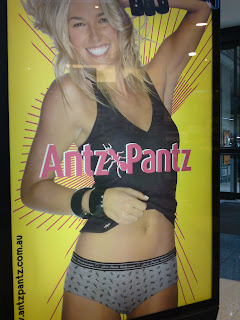
Antz Pantz in the Mall


Mall advertising, East Gardens.  Strong campaign  for this new underwear brand - needless to say, it stopped a lot of foot traffic :)


Sickly Health Shop


Health Zone, East Gardens.  Clutter, clutter, and ... more clutter makes for a very difficult shopper experience in this information-intensive category.  Not only is there an out of date, irrelevant promotion still running, but it has been plastered over with tacky price ticketing on the front promotional bed.  This business looks like it needs a serious health check.


Sharper display from Freedom


Freedom, Moore Park.  In contrast to their front of store display, this is a very sharp display from Freedom.  Their visual merchandising does seem a little inconsistent at the moment.


Retail Landscape


Sep 21, 2009

Emporio Armani undercover


Emporio Armani, Martin Place.  Sometimes, no matter what you do, your best marketing presentation can be undone by things beyond your control.  These noisy dudes were certainly a distraction from a stunning window display on a Friday evening.


More dramatic monochrome


Jewellery store, Castlereagh St.  Beautiful.

Monochrome beauty


Boutique, Chatswood Westfield.  An impactful window, but no reinforcement of the brand identity.  The black lettering on the clearance offer window decal is also too dark to be noticed.  


Bed Bath n Linen


Bed Bath n Linen, new store, Moore Park Supercentre.  Good looking new store- will be interesting to see how they go. Their window graphics are usually quite inspirational.

The Psychology of Sitting


David Jones department store, Castlereagh St.   I was in DJs with my partner on Saturday afternoon when we found ourselves in the high end womenswear brands department (how surprising !). I was interested to see they had some lounge chairs set up.  Wanting  to take the load off after an afternoon's shopping I thought this was a good idea, until I had a closer look.

The two chairs looked stylish and comfortable, but something was wrong.

Firstly, the chairs were placed right up against the POS counter - one at each end.  This is psychologically not a very comfortable place to sit, especially if you are a male (presumably the majority of those expected to use the chairs ?).  A closer look revealed that each chair had some merchandise or hangers on them (look closely at the pic).  So, the staff were using them as benchtops.  also, not very inviting.

Quite frankly, this displayed a total lack of shopper insight, and turned what should have been a positive into a negative. It couldn't have been less welcoming for a bloke - apart from the 'death stare' from the plummy-mouthed sales assistant that is :() So, I just stood around getting a tad impatient, and we eventually left without buying anything (again, how surprising !)


Freedom merchandising underwhelming


Freedom, Moore Park.  We really enjoy going up to our local Freedom store.  Suffice to say we were underwhelmed when we saw this at the front (open wide) entrance of the store.  The season's colours could have played a part (?) but the display looked drab and ordinary.  Other parts of the store were well merchandised.  Clearly they do not recognise the importance of front of store in setting the tone for a customer's shopping experience.


Innovation to a Tee


Bus shelter ad, Circular Quay. Innovative advertising by Bonds.


Coles gets re-Laid


Coles, Surry Hills.  In another sign of fresh management  having an impact at a local level, Coles Surry Hills is getting a new merchandise layout.  The main focus seems to be the important health, beauty and personal care categories.  The pic shows work in progress, which has resulted in a more easily navigable display in what is a very busy old store always tight on space. It will be interesting to see whether the high levels of lighting traditionally in this area are implemented on the new displays.  

Has anyone noticed this happening at any other Coles supermarkets ? It would be interesting to know whether this is a store- or category-specific initiative.


Retail Landscape