:::||> CONVERT SHOPPER INSIGHTS INTO CASHFLOW <|| :::

retail marketing strategy, consulting assignments, executive workshops, conferences and research services, merchandising ideas, advertising ideas, consumer behavior, shopper behavior, shopper marketing, shopper insight, retail e-commerce


Mar 29, 2009

WALL OF COLOUR

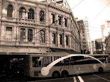
In Waterloo. Tile shop comes alive at night.

Mar 26, 2009

MELLOW YELLOW SELLS

Have you ever noticed how prevalent the colour yellow is in the visually cluttered supermarket environment ? Experts say that yellow is more visible than other colours in the spectrum. Certainly if you look at the accompanying video clip yellow stands out most prominently and blue is a very recessive colour in the relatively dimly lit supermarket. Whatever possessed Coles to issue blue uniform shirts to their staff is beyond me – maybe it was so they would blend in ? It is also very corporate, 'unfriendly', and unwelcoming.

Coming back to yellow, you can see how packaging designers would look to this colour. Not only does it stand out, it is warm, friendly and engaging, and suggests health and vitality. It also carries value connotations, especially when black type is used in bold on yellow backgrounds - which does, however, limit it's application for premium products. The PAK ' N SAVE brand in New Zealand is an outstanding example of the power of yellow when executed well.

Red/orange is a mixed bag in the store – often the red is too dark, the orange/ tomato red stands out a lot more.

Food for thought for those designing in-store,signage POS and packaging.

RED HOT


Adairs new season look stands out. Moore Park.

SPLASH

Of iPod colour stands out in dull category. Harvey Norman Moore Park

MINI MAC

New mini Apple dept DSE Moore Park

OUT OF SPACE?

Fast growing Howard's Storage World franchise battles to cope with
deliveries. Moore Park.

Mar 24, 2009

ALIVE AND WELL


Great vitamin and health supplement store - GNC in Broadway. I like the way the entrance and the wooden floor are welcoming, as stores in this sector can often be intimidating to newcomers . The 'wooden' fixtures show off the colours of the busy packaging typical of this sector. Lighting and ceiling treatment is contemporary without being over the top. The wall graphics are complementary and do not dominate the shopfloor displays. The store is spacious. Also, good use of POS posters.


ORANGE KIOSK

Internet kiosk, Broadway mall, use of orange is tricky in low-light mall conditions. Warm colour, strong, friendly signage, perhaps a lesser ergonomic design than seen previously - see this post.
http://shoppologist.blogspot.com/2009/03/escape-mall.html

DAZZLING DIVA

Very busy Diva costume jewellery store, Broadway mall. Tuesday, lunch-time.

Targeting Gen-Y, selling low-value, high volume, fast-changing 'disposable' jewellery. Perfect for the recessionary environment. Interesting to note that while it attracts customers from a much broader group, it is very focused. Great, strong branding and use of brand iconography (the heart - for the blokes out there :) )


CHARITY THAT SELLS

Charity store, Oxfam, clearly starting to up its standards - as it needs to, to compete in today's marketplace. Broadway mall, lunch time, Thursday.

Mar 19, 2009

PAINT IT BLACK


I am an habitual shopper of consumer electronics stores, one of the few retail domains which is male-friendly.  The Dick Smith electronics chain has always been on my repertoire list, but most of the smaller stores have tended to disappoint in terms of range, presentation and service,  and I have generally preferred the larger format Powerhouse stores.  In fact, the Broadway store featured in this mini-review looked more like a toy-store at Christmas, and a badly run one at that.

The new image campaign, including TV ads, has simplified the brand hierarchy - Powerhouse is gone, and the brand has returned to its heritage as Dick Smith - a place for 'tech experts'.  

As mentioned in a previous post - see below - the use of black in the logo is spot-on - male and 'techy', rather than the very corporate blue for Powerhouse, and straightforward and simple, rather than the use of many visual elements in the old logo. In the smaller stores, the yellow tended to dominate and distracted from the black.  Black is a difficult colour to use in a balanced manner outside a fashion environment, so the treatment for the re-launch was very interesting.

The video clip below shows that an excellent balance has been achieved in the new-look store in Broadway.  The clutter of the previous store has gone, and it looks like the range has been simplified and been presented with clear planogram-driven merchandising disciplines.

The layout is simple and easy to follow, despite the tight space in the (expensive rental mall) store.  The service area is well lit and easy to navigate, and the small items prone to stock loss are close by for easy observation.  

I liked the use of yellow accents with the web-site url on the black 'dump bins' - great reinforcement with a dash of colour. While some parts of the store are still a little dowdy - some product simply does not lend itself to display on grey/charcoal fixtures - the overall impact is positive, and a huge improvement.

It could just have been 'opening week syndrome' but staff were helpful and friendly too. Worth a visit.


Mar 18, 2009

SCARVES THAT FLY


Outstanding window at Hermes, Collins St, Melbourne.

BLAND WINDOW DISAPPOINTS

Kikki.k QVB not up to usual standards. Colours are too insipid for a
busy commuter environment.

Mar 17, 2009

ESCAPE THE MALL

Internet kiosk East Gardens with colour that differentiates in sea of
visual clutter. Easy, friendly signage possibly overdone.

THE COLOUR SMIGGLE

Great use of colour throughout the store and in window creates funky
environment. Smiggle East Gardens.

BLACK POWER

New Dick Smith signage Moore Park is 'on brand' - masculine and techy.


WORLD OF COLOUR

World Square, Sydney has a lot of small, narrow spaces, and is a very busy commuter thoroughfare. I thought the use of changing colour in this section of the centre was a good way to 'lighten the sensory load' and draw attention away from the narrow space.

Mar 15, 2009

AERO DYNAMIC

Aero Plus is the retail front for an Australian design company with presence in Melbourne and Sydney.  We came across this store in the quiet Southgate centre on the Southbank in Melbourne, and were impressed with how busy it was (Sunday afternoon), compared to the rest of the centre.  Expecting premium prices, I was pleasantly surprised how reasonable the funky designs of everyday items (from juicers to folders) were priced.  The designs have a slightly quirky aspect which enhances appeal.  The store is small (hence the poor footage - apologies).  Worth a visit. 

Mar 14, 2009

TITLE BY NAME AND CONTENT

One of my favourite specialty shops is Title in Crown St, Surry Hills.  They provide an interesting arthouse blend of mainly music and movie content in a low-key environment.  The owners are importers and distributors into Australia of some specialised product which means the range on offer is always top-notch, although prices are usually premium.  Have a look at the review video - this shop is not for everyone, as the overwhelming range and the often low service levels mean that you have to know what you want, and be prepared to look for it.  The exploration can be hugely rewarding, and is a pleasant contrast with the commoditised way content is sold in 'mainstream' music stores.

VOODOO WINDOW


Smiggle's voodoo display catches attention, but unless you know the product on offer, the message is a little obscure.  it does, however,  have cut-through.  Broadway mall.